
47 Book Publisher Logos: A Job Seeker's Guide
BookJobs NYC · June 19, 2026
If you are hunting for book publishing jobs in NYC, you will eventually be asked which publishers you admire or which imprints you follow. This is a visual catalog of 47 NYC-area publisher logos — each linked to that company's job page — with notes on what each publisher is and why it matters for your career.
What are publisher logos?
A publisher logo is the visual mark (sometimes called the colophon, from the Greek word for finishing touch) that identifies which company released a book. On most books you will find it on the spine near the bottom, and again on the copyright page inside the front matter.
Large houses often use one parent mark and distinct logos for individual imprints. Penguin Random House is the clearest example: the penguin appears on many spines, but Knopf has used its own borzoi colophon since 1925.
Why publisher logos matter for your career
Learning publisher logos is really about learning imprints — the editorial brands behind the marks. Imprint knowledge is how the industry tests whether you're serious. A hiring manager might reference “a very Knopf book” or ask what you think of a recent acquisition at one of their imprints. Candidates who can follow that conversation look like insiders; candidates who can't look like they Googled the parent company five minutes before the interview.
The fix is straightforward: go to a bookstore, pick up books in your target category, and read the copyright pages. The names and logos you find there are the ones people actually use in interviews and on the job.
Big Five publishing house logos
The Big Five are the five largest trade publishing conglomerates, and together they fill the majority of NYC publishing job listings. Each parent company owns dozens of imprints — semi-independent editorial brands with their own lists, cultures, and identities. A role at Knopf is a very different job from a role at Berkley, even though both are Penguin Random House.
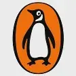
Penguin Random House
The orange-and-white penguin in an oval is one of the oldest continuous marks in trade publishing. PRH formed in 2013 when Bertelsmann merged Penguin and Random House; Knopf, Viking, Riverhead, and dozens of other imprints operate underneath it, many with their own colophons on book spines.

HarperCollins Publishers
The HarperCollins logo shown here pairs red flames above blue waves in a square emblem. It is the second-largest of the Big Five, with imprints spanning commercial fiction (William Morrow), literary (Ecco), romance (Avon), and a substantial children's division.

Simon & Schuster
The S&S logo is The Sower, a woodcut figure scattering seeds inside a thick black square frame, adapted from a Jean-François Millet painting the founders saw in their first week in business in 1924. KKR acquired the company from Paramount Global in 2023, making it the only independently owned major trade publisher in the U.S.

Hachette Book Group
Hachette Book Group uses a blue geometric "H" built from interlocking bands as its parent mark. The U.S. arm of Hachette Livre spans literary fiction, commercial nonfiction, audiobooks, and imprints like Little, Brown, Grand Central, and Orbit.
Macmillan
Macmillan's logo is two thick red wavy bands stacked horizontally. The mark covers a diverse portfolio: FSG for literary fiction and poetry, St. Martin's Press for commercial books, Tor for science fiction and fantasy, and Macmillan Children's for younger readers.
Major trade & children's publisher logos (22)
These publishers sit just outside the Big Five but show up regularly in NYC job listings. They range from W. W. Norton — the largest employee-owned publisher in the U.S. — to Scholastic, which has a bigger cultural footprint in American childhood than any trade house, to smaller but serious operations like Abrams and Bloomsbury USA.
ABRAMS
The Abrams logo is a white capital "A" inside a solid red circle. Founded in 1949 on the belief that art books deserve the same care as the artworks they document, Abrams is today the largest U.S. publisher of illustrated books, with imprints spanning children's, lifestyle, and general nonfiction.

Bloomsbury USA
The Bloomsbury colophon is Diana the Huntress, whose figure and raised bow curve together to form a stylized "B". The independent London publisher changed history by releasing the Harry Potter series; today, its New York office publishes acclaimed literary fiction, serious nonfiction, and academic titles without a corporate parent.
Crooked Lane Books
Crooked Lane's logo stacks its name above a graphic of a winding path between two hills. Founded in 2015, the New York press fills a gap the Big Five largely abandoned, specializing in cozy mysteries, thrillers, and hardboiled detective fiction that regularly hit bestseller lists.

Disney Publishing
Disney Publishing uses the familiar Disney script wordmark, often alongside the Hyperion imprint's sun-and-mountain motif. The publishing arm produces picture books, chapter books, and YA titles; knowing the distinction between Disney-branded IP and Hyperion's standalone editorial identity is exactly what interviewers will probe.

Holiday House
Holiday House uses a classic serif wordmark with oversized red "H"s and an illustration of a child reading. It is one of the oldest independent children's book publishers in the U.S., known for rigorous editorial standards and publishing exclusively for young readers since 1935 without a corporate parent.
Kensington Publishing
Kensington's logo is a black brush-stroke lowercase "k". Headquartered in Midtown Manhattan, it is one of the largest remaining independent publishers in the U.S., building its reputation in genre categories including romance, African American fiction, mystery, and urban literature.

Open Road Media
Open Road Media's logo features bold coral "OR/M" lettering. Operating at the intersection of publishing and tech, the New York digital publisher licenses and distributes ebooks for a massive catalog of backlist authors, including Judy Blume and Pat Conroy.

Scholastic
Scholastic's logo is a white open-book icon on a red square. As the world's largest publisher and distributor of children's books, its ubiquity is unmatched—from classroom book fairs to the U.S. editions of Harry Potter and the Graphix imprint.

Skyhorse Publishing
Skyhorse's logo features overlapping white "SP" initials inside a solid black square. Founded in 2006, the New York press operates a scrappy, fast-moving model built around high-volume acquisition of out-of-print titles, controversial nonfiction, and practical guides.

Sourcebooks
Sourcebooks uses an orange circle with a cream line forming both an "S" and a lightbulb shape. The employee-owned press is one of the fastest-growing independents in the U.S., known for a highly data-driven editorial approach and strong lists in romance (Casablanca) and children's books.



The Quarto Group
The Quarto Group's logo is a minimalist black ring with a small dot forming a stylized "Q"—a nod to the quarto printing format. The global publisher operates at a mid-market scale, producing illustrated books across art, design, cookbooks, and children's nonfiction under dozens of imprints.

W. W. Norton & Company
W. W. Norton's logo is a white seagull in flight on a navy blue square. Founded in 1923, it is the largest independent, employee-owned trade publisher in the United States, giving it a unique editorial culture free from corporate parent oversight.
Literary & independent press logos (8)
Independent presses are smaller operations than the conglomerates, which means tighter teams, broader job responsibilities, and a culture where everyone actually reads the books. Several have a strong NYC presence: Grove Atlantic, Verso, Melville House, Soho Press, The New Press, Feminist Press, and Zando all have offices or hire regularly in New York.

Feminist Press
The Feminist Press logo shows a red flame inside an orange oval, with the name on a black ribbon banner. Founded in 1970 and based at CUNY's Graduate Center in Manhattan, the press focuses on work by and about women, maintaining an extensive international translation program and recovering out-of-print classics.

Grove Atlantic
Grove Atlantic's logo is a black geometric "Y" built from blocky rectangles. The New York independent combines two historic imprints—Grove Press and Atlantic Monthly Press—and is known for publishing Beckett, Ginsberg, and Henry Miller during the era of censorship battles.
Lakeside Book Company
Lakeside's logo stacks green text with "Est. 1864" flanking a small book icon. Primarily a book manufacturing company operating printing plants across the U.S., it also owns Dover Publications, a New York imprint known for affordable reprints of classics and art instruction books.

Melville House
Melville House's logo is a cyan house shape with an offset triangular roof. The Brooklyn-based independent is known for its Art of the Novella series, international literature in translation, and a strong political voice that takes on books larger publishers find too risky.
Soho Press
Soho Press's logo is bold, condensed "SOHO" in all caps. The New York independent is best known for Soho Crime, an imprint that publishes international crime fiction organized by country of origin, alongside a parent list of literary fiction and narrative nonfiction.
The New Press
The New Press logo is a red circle with white curved lines and stacked lettering. Founded in 1990 by André Schiffrin after leaving Pantheon over corporate conflicts, the nonprofit publishes serious nonfiction on law, civil rights, and social policy regardless of commercial viability.
Verso Books
Verso's logo is a bold red capital "V." With offices in Brooklyn, it is the U.S. arm of the largest radical publisher in the English-speaking world, publishing political theory, economics, history, and cultural criticism from leading left-wing thinkers.

Zando
Zando's logo is a white geometric mark with a red dot on a bright blue square. Launched in 2020 by former Crown publisher Molly Stern, the independent operates a hybrid model where celebrity and high-profile authors launch their own branded imprints.
University & academic publisher logos (8)
University presses with New York or New Jersey offices, where trade and scholarly publishing overlap in ways that create interesting editorial careers. Columbia University Press and Oxford University Press both run significant trade lists alongside their academic catalogs. Wiley, Teachers College Press, and Princeton University Press round out the local presence.

AIP Publishing
AIP Publishing's logo is white fanning rays on a dark blue rounded square. As the publishing arm of the American Institute of Physics on Long Island, careers here lean toward STM journal production, editorial coordination, and digital platform work rather than trade editing.

Columbia University Press
Columbia University Press uses a light blue crown on a navy square, drawn from the university's heraldry. CUP is unusual among university presses for having a genuinely competitive general-interest trade list alongside its strengths in Asian studies, political science, and urban history.

Guilford Press
Guilford Press's logo here is a commemorative "50 Forward" design in gold and navy. Founded in 1973, the New York publisher occupies a niche between academic presses and trade health publishers, producing textbooks and self-help books in psychology, psychiatry, and neuroscience.

Oxford University Press
Oxford University Press uses a white ring logo with slanted lines on navy. The U.S. office in Midtown Manhattan handles North American trade, academic, and educational publishing across every discipline, operating at a scale that rivals mid-sized trade houses.

Princeton University Press
Princeton University Press uses a bold orange chevron on a dark background. A short commute from NYC, the press has produced some of the most discussed serious nonfiction of the past two decades, successfully publishing economists, historians, and scientists for general audiences.

Teachers College Press
Teachers College Press uses a light blue crown on navy, matching Columbia University's heraldic style. The Manhattan press is small and academic, focusing on education research, curriculum, and policy, making it a real option for educational publishing careers in NYC.

Wiley
Wiley's logo is a white serif "W" inside a green circle on black. Founded in 1807, the Hoboken-based publisher operates at a massive scale across science, technology, medicine, and business, offering career paths in journal publishing, digital products, and professional education.
Specialty & digital publisher logos (4)
These publishers don't fit neatly into trade or academic categories, but they hire editors, marketers, and production staff in New York. Audible and Amazon Publishing operate at scale; Phaidon and Book of the Month are smaller but well-regarded. If you're open to roles outside traditional editorial, these are worth knowing.

Amazon Publishing
Amazon Publishing uses the white smile-arrow icon on an orange background. Operating entirely outside the traditional bookstore channel, it is one of the largest trade publishers by volume, with imprints covering romance, crime, book club fiction, and literary fiction.

Audible
Audible's logo is a white open-book and sound-wave icon on an orange square. Based in Newark, it is both the dominant audiobook retailer and a publisher of Originals, making it the most significant employer in the region for audio production, rights, and digital marketing.

Central Conference of American Rabbis
CCAR Press uses a 3x3 grid of red and orange squares. As the publishing arm of the Central Conference of American Rabbis, it is a specialized religious publisher producing liturgical texts, prayer books, and educational materials for Reform Judaism.
Phaidon
Phaidon's logo is a black Phi symbol (Φ) with serifs on a yellow square. Based in London with New York offices, it is one of the most prestigious art publishers in the world, specializing in visual arts, architecture, design, photography, food, and fashion.
Frequently asked questions
Where do you find a publisher logo on a book?
On the spine, usually near the bottom, and on the copyright page inside the front matter. Some imprints use a wordmark; others use a symbol. Knopf has a borzoi. PRH has the penguin. Bloomsbury has Diana the Huntress, her bow and figure forming a stylized B. Flip to the copyright page of any book and you will find it.
What is the difference between a publisher logo and an imprint?
The logo is the visual mark. The imprint is the editorial brand behind it. Farrar, Straus and Giroux is an imprint of Macmillan, so you may see both the FSG logo and the Macmillan mark depending on which spine you are reading. Large parent companies own many imprints, each with its own list, editorial identity, and sometimes its own colophon. The Association of American Publishers is a useful reference for how those parent-imprint relationships work across U.S. trade publishing.
Do I need to memorize every publisher logo to get a publishing job?
No. Focus on the Big Five parent marks plus whatever imprints are active in the genre or department you are targeting. If you want to work in literary fiction, know the FSG and Knopf colophons. If you want to work in commercial fiction, know Putnam, Berkley, and Gallery. Publishers Weekly deal and personnel coverage shows you which imprints are active in your genre without memorizing the whole field.
Find Your Next Book Publishing Role
Create a free account and select your job categories to get a personalized feed of matching book industry roles.
Create a free accountKeep reading